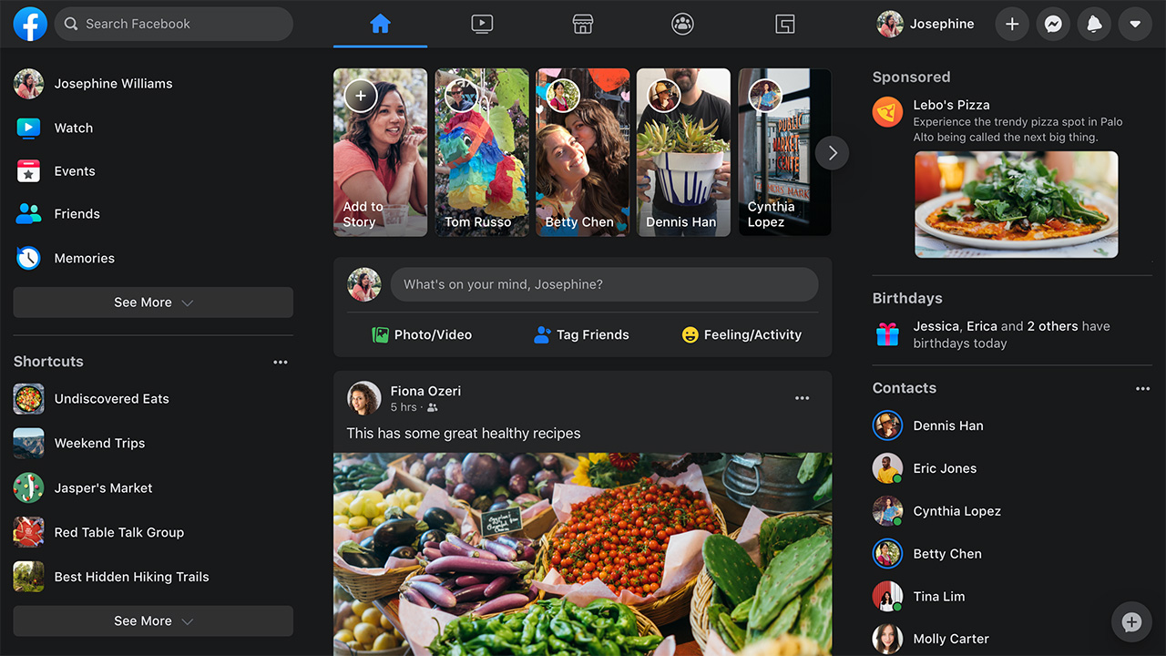
The new Facebook is available for everyone!
Unveiled to the public during the F8 developer conference, the new desktop version of Facebook. It will be available to all users starting today. The company has announced the start of the roll-out, i.e. distribution to the public. Faster and easier to use, the new user interface is also designed to strain your eyes less thanks to the new dark background mode.

Facebook has 16 years on his shoulders, and over time has introduced several new features and has increasingly adapted to new form factors and devices. In addition, the company admitted that it paid more attention to mobile and not to the desktop version; which has lagged behind in terms of innovation and graphics. For this reason, the decision to completely renew it, not only on the aesthetic level but also on the functional one: "We have done some research in the field, talking with users to understand how to improve the web experience, and today we are happy to present you the new site, a new starting point for the next years of Facebook.com“, declares the company.

Facebook.com, the news in pills as announced by the company
- Find things faster: Find what you are looking for faster thanks to the new simplified navigation. In addition, the homepage will load faster and the transition from one page to another will be faster.
- Cleaner look, bigger texts: larger fonts and a simplified layout will simplify your operations.
- Watch photos and videos in full screen: stay updated and comment Stories, videos and albums thanks to a new, more engaging layout.
- Manage Pages, Groups and Events easilye: with the new version, it is easier to create Events, Pages, Groups and insertions. You will be able to preview in real time a new Group that you are creating, checking how it looks from mobile before publishing it.
- Fatigue less eyesight: the new Black Background mode is less bright, with less contrast and less brilliance. This mode minimizes screen reflection for use in low light conditions.
There desktop version of Facebook it therefore becomes more modern by acquiring new functions and an interface that approaches the mobile one in style and intent. And it is likely that this choice will displease many users, now accustomed to the old interface desktop with smaller characters and elements. What is evident with the new style is that in the same space there are less interactive objects, with an optimization of the lower spaces and a UI designed more for users who use the touch than those faithful to the dear old combination of mouse and keyboard .
How to activate the new Facebook interface
Users who have already received the functionality can click on the arrow pointing down, at the top right of the main Facebook screen, and then select "Switch to New Facebook".
How to activate dark mode on the New Facebook
You must first activate the new web interface, and then click on the arrow pointing down, at the top right of the main Facebook screen, selecting instead "Dark mode".

What if there isn't the word "Switch to New Facebook"? In this case it will be necessary to wait a few days before being able to activate the new interface. The new Facebook with dark mode will arrive on all Facebook accounts within the next few weeks and will include several new features in addition to the simple aesthetic modification: the Stories have been moved over the line to update the State, while above them there will be a new menu with five tabs which lead to the News section, Facebook Watch, Marketplace, Groups and Events.
Big news of the new design is the presence of the Groups within the list of tabs (the same menu previously was in the left column), which highlights the company's willingness to push this specific part of the social network. Clicking on the specific button will access a personalized update feed from the individual groups followed, with the platform that will suggest new groups based on the user's interests.


