WhatsApp Templates: How to Write Them, Get Them Approved, and Increase Your CTR
Why templates matter
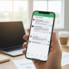
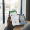
Templates (pre-approved proactive messages) are key to starting conversations on WhatsApp outside the 24-hour window from the customer's last message, for notifications, marketing, and authentication. Writing them well means more approvals, fewer blocks, higher CTRs, and higher conversions.
Types of Templates and When to Use Them
Meta classifies templates into three main categories:
Utility: confirmations, receipts, order updates, appointment reminders.
MarketingPromotions, cross-selling/upsells, reactivations, new products. They require explicit opt-in.
Authentication: OTP and two-factor verification.
Choose the category based on the actual purpose of the message: improper use can lead to rejection or a drop in quality.
Structure of an effective template
A template may include:
Header (optional): Short text, image, video, or document. Great for increasing attention and click-through rates (e.g., mini-hero product or QR code).
Body: main message with variables
{{1}},{{2}}…Footer (optional): micro-note or disclaimer.
Buttons:
Call-to-Action: until 2 buttons (1 “Call”, 1 “Visit site”).
Quick Reply: until 3 quick answers.
URLs can have dynamic parameters via variables
Approval requirements and grounds for refusal
Key guidelines:
Consistency between category and content.
Clear, non-misleading text, without sensitive or prohibited language.
Well formatted and sequential variables (
{{1}},{{2}}), no special symbols inside variables.Avoid templates that begin or end with an empty variable.
If rejected, please correct and resubmit or forward aappeal with explanations.
Quality, shipping limits and risks
WhatsApp assigns templates a quality rating (green/yellow/red) based on user feedback; low quality may reduce submission limits and lead to template pauses/stops. Monitor Insights of the template (opens, button clicks) in the WhatsApp Manager and intervene with A/B tests if the signals worsen.
12 Best Practices to Increase CTR
Value in first row
Put your "hook" in the first 120–140 characters. Avoid long salutations.Real customization
Use variables for name, product viewed, city, time slot, or specific benefit. If relevant, add a dynamic header image.Singular and clear CTA
One objective per template. Avoid double intent ("Discover" + "Book"): they reduce CTR.Buttons > links in text
CTA buttons are more clickable on mobile and improve readability.Specific economic proposal
Percentage, deadline, remaining availability. Real urgency beats generic urgency.Social proof and risk reduction
Micro-testimonial/score, free returns, guarantee or chat-assisted.Intelligent localization
Create versions by language/country/price segment. Same concept, vocabulary, and local social proof.Timing and frequency
Send when the user is receptive (e.g., a booking reminder the day before at 6-8 PM). Respect the opt-in requirement and limit marketing touches to avoid compromising quality.Controlled A/B testing
Test only one element at a time: first-line subject line, yes/no image, incentive, CTA verb, button format. Use balanced samples and clear metrics (button CTR, session conversions).Landing page consistency
The landing page must include the title, offer, and header creative to avoid drops.Media design
Sharp images, centered subject, little text, discreet logo. Short vertical videos with subtitles.Continuous maintenance
Remove/update templates with declining CTR or yellow/red quality; duplicate "winning" ones for seasonal opportunities.
Ready-to-use examples (IT)
1) Utility – Appointment confirmation with reminder and reschedule
Header: agenda image
Body:
Hi {{1}}, remember your appointment on {{2}} at {{3}} at {{4}}. If you can't make it, reschedule with just one click.
Footer: See you soon
Buttons:
• Visit site → https://esempio.com/appuntamenti/{{5}}
• Quick Reply: “Move appointment”
2) Marketing – Cart reactivation with a time incentive
Header: product image in cart
Body:
{{1}}, your cart awaits: -10% valid until {{2}}. Size/color still available. Complete in seconds.
Footer: Limited Offer
Buttons:
• Visit site → https://shop.esempio.com/cart/{{3}}
• Quick Reply: “Need help”
3) Marketing – Post-purchase cross-selling
Header: accessory image
Body:
Thanks for your order {{1}}! For your {{2}}, we recommend {{3}} with free shipping until today.
Footer: Personalized advice
Buttons:
• Visit site → https://shop.esempio.com/addon/
Anti-rejection checklist before sending
Category consistent with the purpose.
Sequential and valued variables.
No misleading claims or prohibited content.
Simple language, without errors, without all caps.
Clear CTA consistent with the landing page.
Opt-in and frequency respected.
Recommended workflow
Define goal, segment and metric (button CTR).
Stretch out 2 variants of the body and, if useful, 2 different headers.
Prepare buttons consistent (one main one).
Submit the template to the correct category.
Run A/B tests on a sub-sample, then scale the winning variant.
Monitor Insights, quality and limitations; update or replace “tired” templates.
Common mistakes to avoid
Marketing templates without opt-ins or too frequent.
Variables are poorly formatted or left blank.
Vague promises (“Super unmissable offer”) without details.
Long, untracked links: Use proprietary domain shorteners or human-readable parameters.
Two conflicting CTAs in the same message